Welcome to GCC's redesigned website!
Take a look around and enjoy what’s new. Have feedback? Tell us what you think—complete our quick feedback form.
2026 Welcome Fair
Get ready for an exciting outdoor Welcome Fair at the Verdugo Campus on Thursday, August 27! Get Started at GCC!
Fall 2026 Open Registration: June 1 to August 28 GCC Promise Plus Program
Free Tuition, dedicated counselors, priority registration, and more! GCC has options!
GCC offers multiple options to meet your individual needs, including in-person, online, and hybrid classes.
Info For...
Events

Financial Aid & Fees
Get Ready for Your First Semester
Get Help
Flexible Options for All
Academic Support
Resources for Your Classes
Enrichment Programs
Learning Support
Health, Safety & Wellness
Get Involved

Events
Around Campus
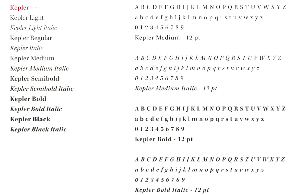
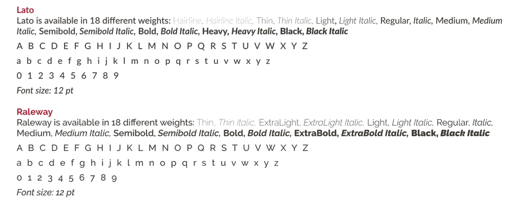
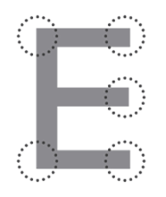
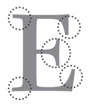 What is a serifed font exactly? In typography, the additional line (or flourish) at
the end of the larger letter is called a serif.
What is a serifed font exactly? In typography, the additional line (or flourish) at
the end of the larger letter is called a serif.
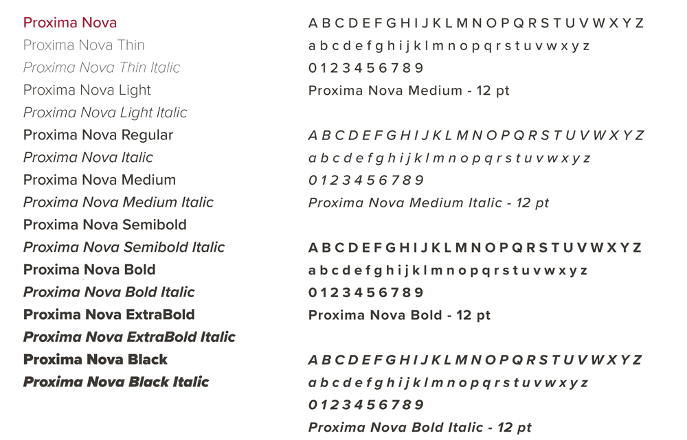
 Unlike their cousins serif fonts, sans serif fonts do not have the added line on each
characters – sans being the French word for without.
Unlike their cousins serif fonts, sans serif fonts do not have the added line on each
characters – sans being the French word for without.